The following blog conversion tips are not for slackers.
Then again, if you were attracted to the heading of this article, it’s likely you’re not one of them.
The reason I mention it, is because there’s a worldwide problem of blog that don’t work optimally. Either they’re visually appealing but don’t convert visitors nor attract traffic via search engines.
Alternatively, they attract traffic but are not appealing and don’t experience high conversion rates.
The amount of web designers who produce masterpieces that really work for their clients, is minimal.
If you become a web designer who creates beautiful blog that are optimized for SEO and high conversions, you’ll experience great demand for your work.
The following tips are just the tip on the iceberg. For an overall view read on the elements that are needed to create a blog that rocks.
Tip #1: Target audience
In the period between getting a new order for blog design and starting the work on it, you need a complete image of your client’s target audience. Understanding who your client’s buyers are, is the basis of online marketing. Since our blogs are at the core of all marketing activities, an understanding of their target audience is key.
The problem with this, specifically with small businesses, is that 90% of the time, they themselves are not even aware of the needs and desires of their target audience. Sure, they may know the basics, but generally, they lack knowledge about the nitty gritty’s; the parts that make all the difference in a website design that attracts and converts.
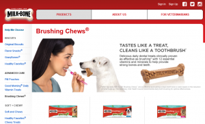
For example, have a look at this example of an optimized website:

The primary image they’ve used in the design – of a woman and her dog, her brushing her teeth and her dog chewing a milk bone – not only appeals to their target audience, but it also gets their message across in a powerful way, without the use of words.
The glance of the woman also faces towards the heading, which further reinforces the message.
The main heading – “Tastes like a treat, cleans like a toothbrush” – nails the product benefit in one sentence, because the company knows that dog owners are concerned about their dog’s teeth for this reason: although dog toothbrushes and meaty toothpaste (yum) are available, dogs don’t usually allow their owners to brush their teeth. They also know that their dogs won’t touch the milk bone if it doesn’t taste nice.
The information on this product page is minimal but it’s all a dog owner needs to know. The design of the page shows that they are very in touch with who their audience is.
Tip #2: Optical hierarchy
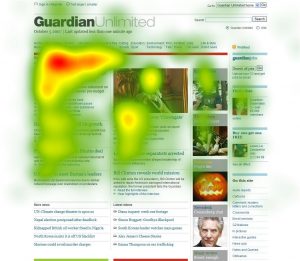
Certain parts of a website are more important than others. This heatmap provides proof of the most important elements of this webpage; where the human eye is drawn to first:

Image Credit: MonetizePros
The red part indicates the “hottest” area on this blog, so the most important element should be placed there.
Bear in mind that certain aspects can influence where the eye is drawn to first, so testing is important. If you want to test it out yourself, CrazyEgg provides free heatmap software you can try.
It’s not only placement that matters. Size and color also influence.
To know what’s most important, you have to understand the client’s business objectives, and what they want to achieve with the blog.
The most important elements for blog conversion, are:
- Heading – what is the blog about? How can it help the visitor? It’s the heading’s job to tell the user, within seconds, why they should not click away to a better blog; your client’s competitor.
- Call to Action – what is the aim of the page? What action must the visitor take?
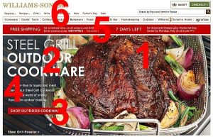
This example by Conversionxl demonstrates good optical hierarchy design:

1: The image of the meat is tantalizing and instantly tells – without words – the benefit to the user. I.e. “the outdoor cookware we sell, can give you meat that looks as great as this. Imagine the taste…”
2: This is the heading and within a few words, explains what the site is about and how it can benefit the user.
3: In third place is the CTA telling the user what to do.
4: The sub-heading supports, with a little more information, the main heading.
5: The banner offering free shipping, together with the “7 days left”, gives a sense of urgency that makes people want to take action faster.
6: Only in 6th place is the navigation bar.
Key take-away
Not all blog designers grasp the value of learning the skills that will make them sought-after web designers.
By incorporating these two powerful blog conversion optimization tips in your design, you’ll reap the rewards when your clients see the outcome of your work in their analytics reporting, and give you free word of mouth advertising as a result.
Because you’ll be better than your peers, the quality of your clients will improve and you can start increasing your prices.
Originally posted on September 29, 2016 @ 8:31 pm
